Revenue Strategy 360
BI tool that improves hotel pricing decisions
My role: UX design
Team: Product manager, UI designer, software engineers
Duration: 12 months
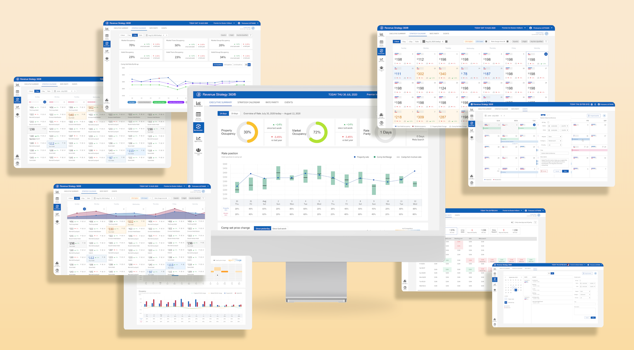
Setting the price for a hotel room is a complex process that changes throughout the day based on multiple criteria from both the hotel and it’s competitors, such as available occupancy, room type, and the number of days the guest will be staying at the hotel. Revenue Strategy 360 is a powerful business intelligence tool used by hotel admins, pulling in data from across competitor hotels and brand partners, helping them make more informed decisions about how to set their hotels prices.
Though it was a powerful tool, there were some challenges with the legacy version of Revenue Strategy 360 that we needed to resolve for our customers:
The legacy application UI — It takes you back in time, doesn’t it?
The application has an extremely outdated UI, making it difficult to use. Even though Revenue Strategy 360 offers richer content than it’s competitors, there was concern that the lack of usability would cause customers to start migrating to new breakthrough solutions that were much easier to use.
With a big contract renewal on the horizon for one of our premier hotel partners, a reinvention of the application was necessary if we were going to secure the contract. The contract renewal had a specific date that the new look of the product had to be ready for, meaning scope creep was not an option.
The first task: Being an advocate for change, a change in product, a change in team UX culture. And change is hard.
The BI side of the business has a very different culture than what I’m used to seeing. They had zero exposure to UX before I joined the team and their development process followed the old Waterfall method; they stated this was used due to a large portion of the team being outsourced. One of the challenges this created was how separated each departments work felt on the project, I would create our designs and hand them off to the engineers, never hearing back from them as they built the product. Another challenge that existed with the team was how little credit they gave to the UX process as a whole, placing the overall usability of the product behind input from data science engineers. Even with these challenges we found a good cadence working together and I was able to instill upon them why the UX process is so important to building a product.
Designing a data visualisation product with a focus on forward-looking trends and insight is fundamentally different to designs that try to guide their users toward a single action.
User interview: We strategically grouped the users into different sessions based on the type of tasks they managed. I wanted to ensure I understood the differences in how the users may interact with this tool based on their roles and responsibilities. I had to understand what the users really want, and which formats would they expect to see the insights presented in.
Next was to define the user flow. I was relentlessly asking “Then what do they do next?“, often the answer I got was “well, that depends“. Frustrated because my user flow had become a maze of tangled journeys. Soon I realized the fact that the typical user of this product is likely to have a set of questions when they set out to explore the insights of hotel rates. My job was to anticipate these questions and provide intuitive and logical ways to answer their questions and guide the user to find their answer. From our extensive conversations with our clients, I saw they have many very interesting questions that they need answers to, for example: How have my competitor hotels changed their rates? Is there a particular hotel that has changed its rate strategy? How am I positioned against the comp set for longer lengths of stay? Is there an internal or external event impacting rates?
Innovation highlight - strategy calendar
By focusing on users’ needs, we successfully designed the most innovative solutions this industry had ever seen. Strategy Calendar. it is the core of this product. It answers the fundamental questions the hotel managers have about how is my hotel rates positioned against my competitors. And are my hotel rooms able to sell in different granular.
Progressive disclosure makes information easier to digest
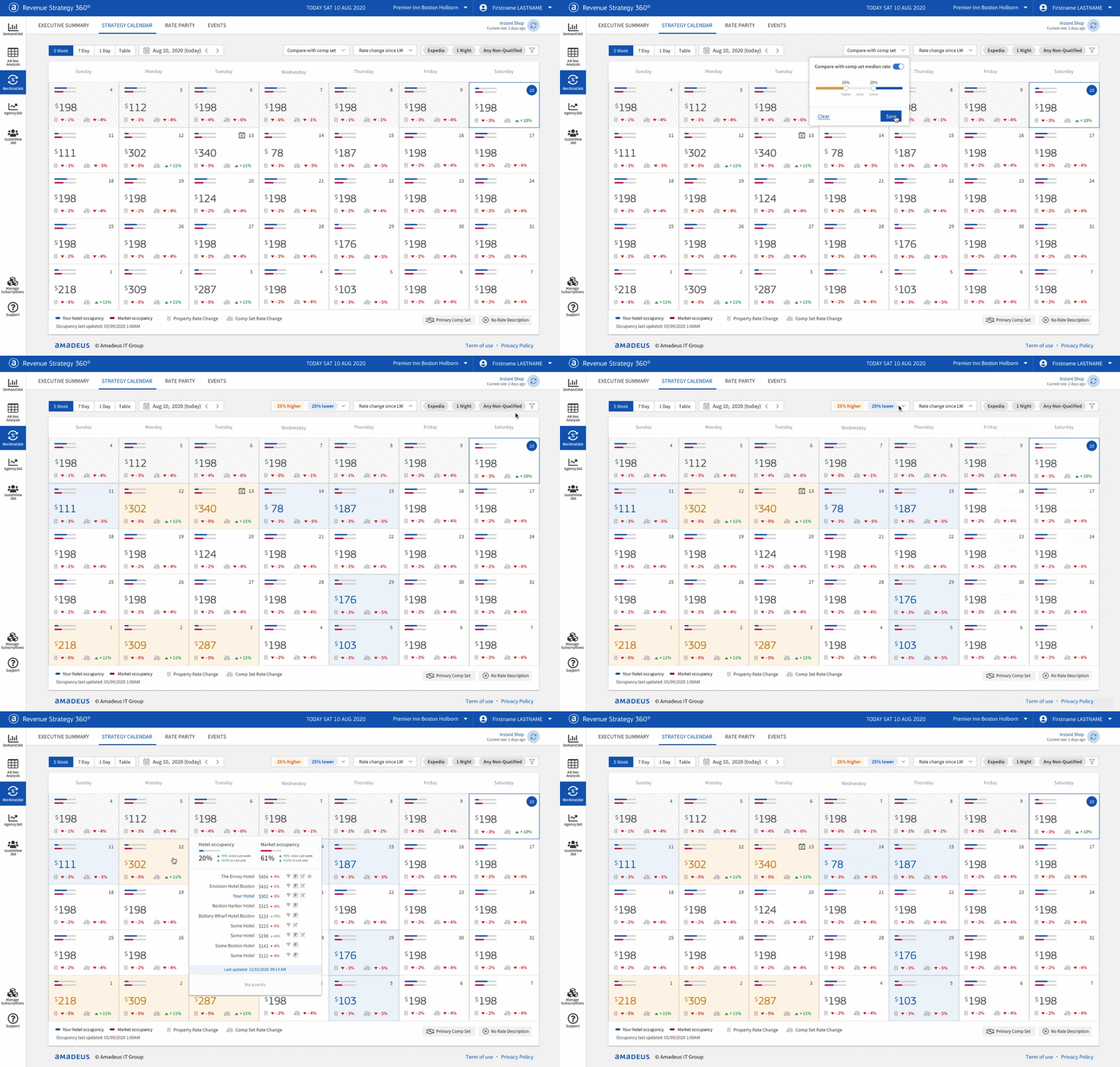
By disclosing information progressively, UI reveals only the essential data at the right time and helps users manage the complexity of information.
The 5-week view is for a quick glance to see how my hotel pricing is looking compared to my competitors. We help them highlight the days that the pricing is either too high or too low. So users could quickly spot a potential problem.
Make it easier to identify patterns, and trends in large data sets
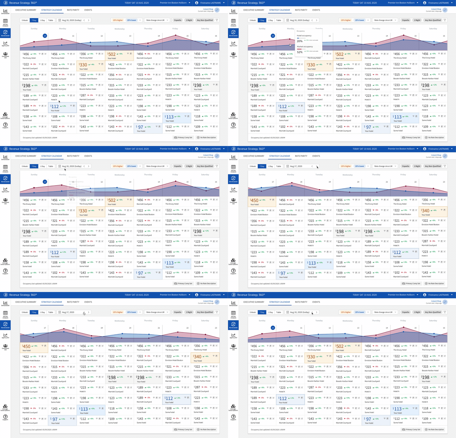
The 7-day view is a very data-heavy page. In order to reduce the cognitive load for our users, first, I try to understand what they are looking for in this set of data and then incorporated the right data vitalization and visual cues to make it as easy as possible to identify competitor strategy patterns, trends and pricing outliers.
To make sure that users are engaged when retrieving the insights that matter to them, the design offers an extensive set of filters to choose from.
Drill down to the bottom of it
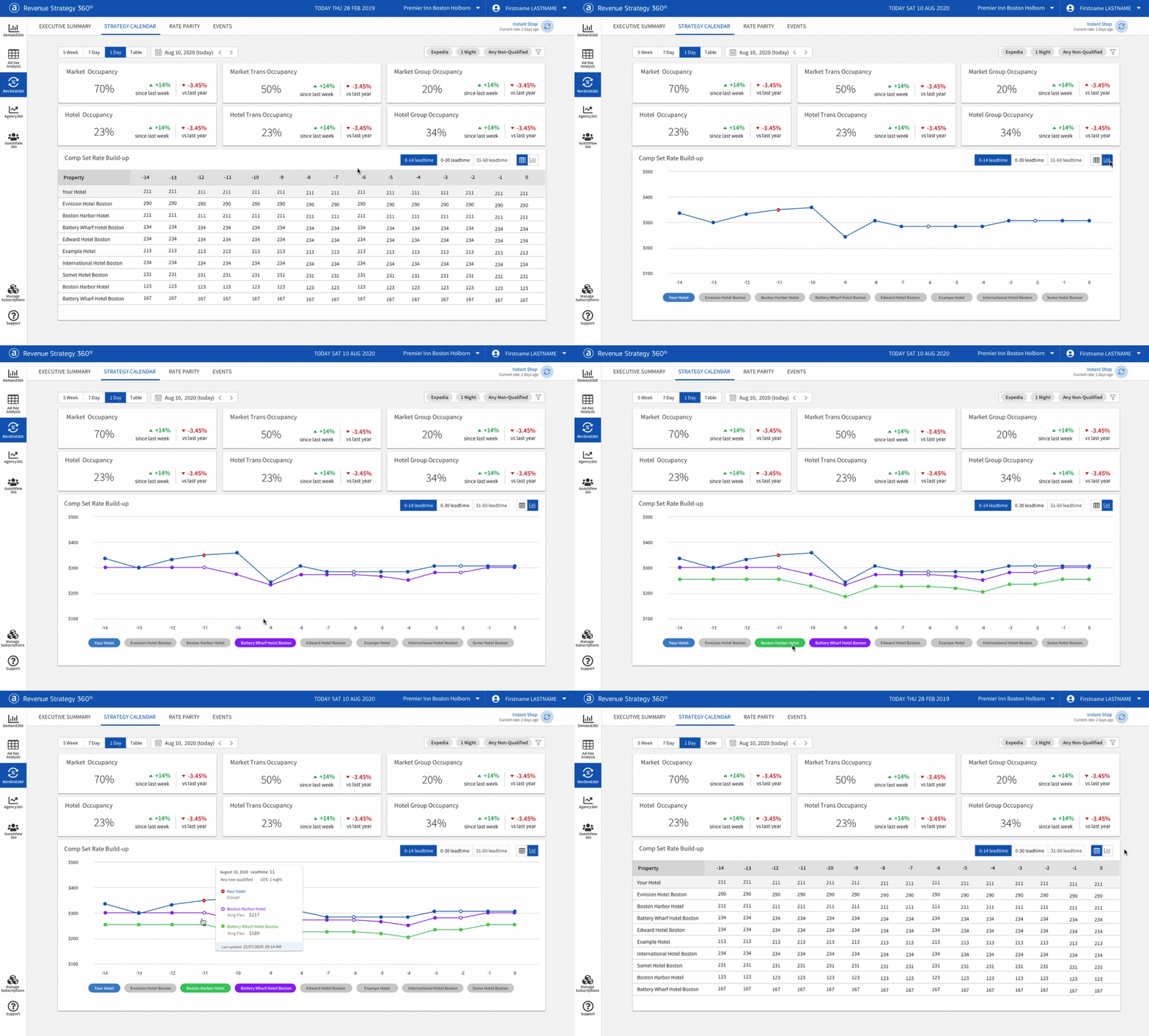
The 1 day view provides the full set of the rate information related to a specific date.
There a a view for comparing rate build-up history with competitor. To reduce visual noise, we have an option to turn on off competitor to get a clear view of what they want to compare
Keep it recognizable for legacy users
Some of our legacy users have been using this application to close to a decade. They have their cadence of working using the legacy UI. Their users expect things to change and improve, but at the same time, they don’t want things to be completely different because that would require them to learn how to deal with a brand new UI from scratch.
An intuitive way to quickly analyse complex data points
My goal was to make the dashboard data visualization provide a clear quick overview, meanwhile offering interaction and customizable filtering to digest rich data contents. Choosing the right chart type for the specific set of data and purpose is very important. We had gone through many iterations and user testing to get them just right. I had found ways to present the data in a visually informative manner so that our users can easily spot problem areas or pricing trends.
Things I learned from working with this product team
This product team had not previously worked with a UX designer. I had not experienced an environment where the look and feel of the product was not a high priority, so I had to learn how to find a middle ground while making progress towards our goals.
Business success is not all about usability
This is painful for any UX designer to realize, that it’s not all about usability. Referring to the “Risk” concept from Marty Cagan’s lectures, besides the usability risks that I cared so much about, there are other risks that need to be considered such as; whats the business risk for the company, whats the feasibility risk for the engineers, and whats the regulatory risks for the data. When my designs would get shut down, if I just kept harping on the importance of design to my various stakeholders I wouldn’t be very effective. No one wants to make products with terrible UX, but it happened because of real pressure to meet business outcomes and in those situations usability was easily overlooked. I learned to understand and practice other stakeholders’ language and try to speak to that and how usability overlaps with what they deeply cared about. It doesn’t always work, but it creates a collaborative working environment.
Take time to think about the long-term effect
From designing two of the tools for the BI platform, I learned to look at and communicate the long-term effect of design decisions. I learned to be proactive, small little decisions will impact the future state.
Be flexible, have principles and let go of the pixels
Letting go of being pixel-perfect isn’t natural for a UX designer. It was not an easy thing for me to accept at the beginning. With the specific development team I worked with on this project, I learned how to gracefully pick my battles. I kept the pixels top of mind, but the user's mental models and workflows were what is most important. These are the battles I chose to fight. Users don’t notice when the fonts are wrong and paddings are off, it doesn’t take away from how the feature works and whether they can do their job.
The Result
The redesign got great reviews from our customers and it helped secure the big contract renewal on time. The redesign also got great feedback within the company. I continued working with the same team to design other products on the business intelligence platform.


